Preview Pane problem.
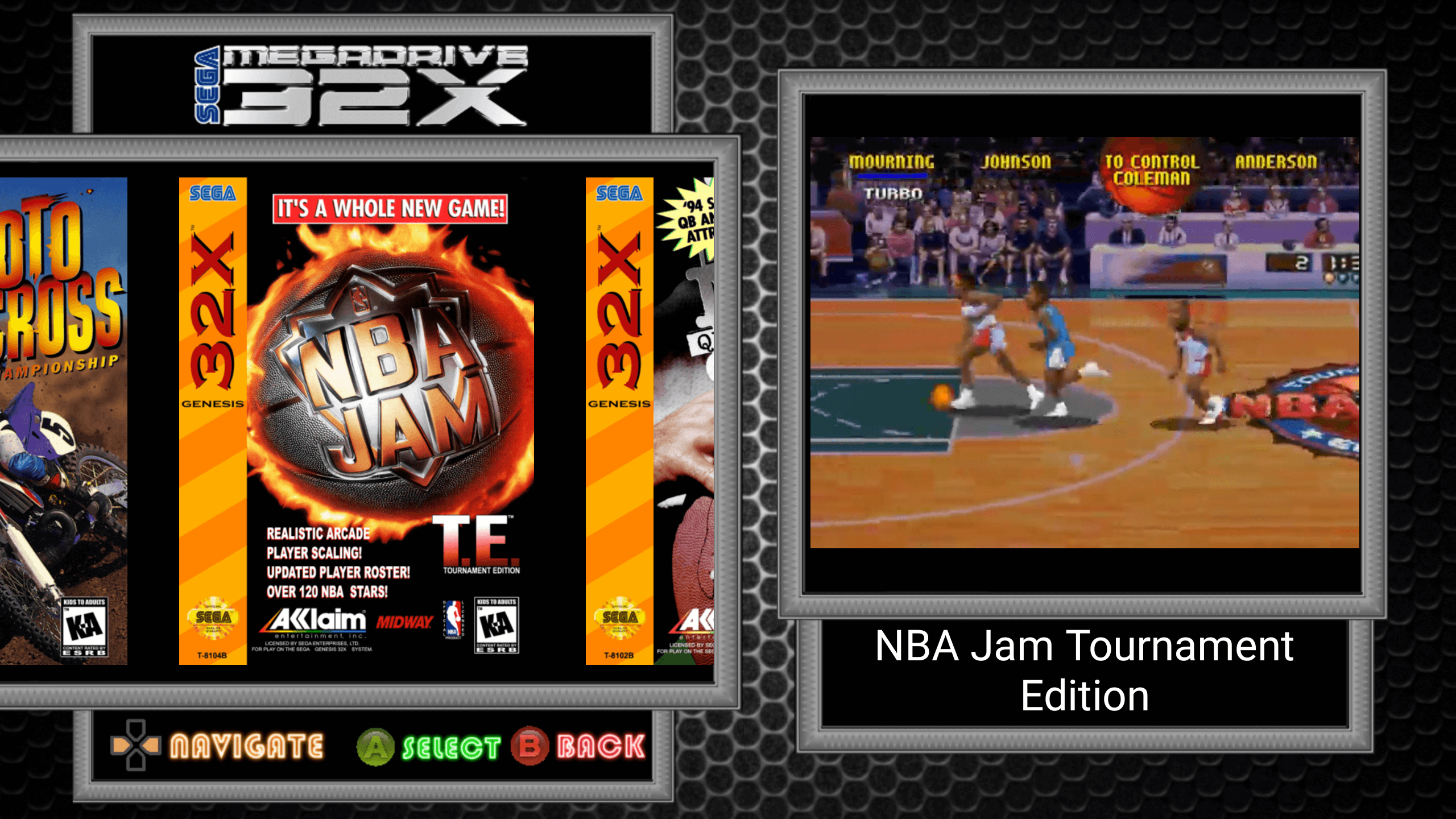
Hi, I'm playing around making a theme that incorporates the video preview pane. The problem is that the vertical position of where the video is displayed is different depending upon the length of the game title. For example, I created this background and everything fits perfect with the game title taking up two lines.
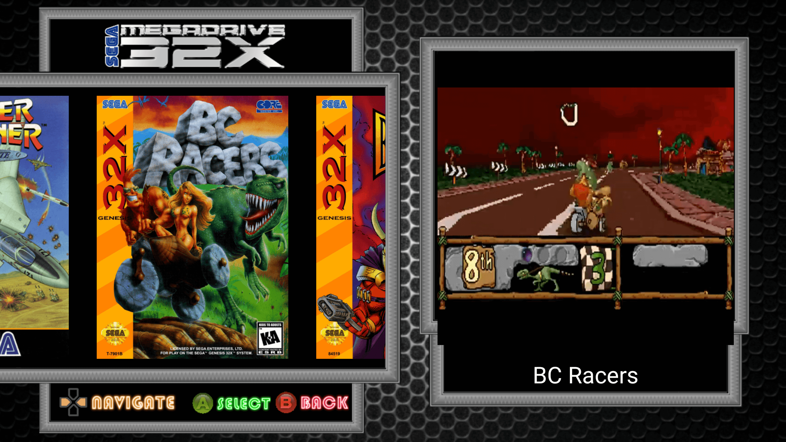
But if the game title only takes up a single line then the video drops down slightly out of frame alignment like this.
Hope this is an easy fix.
Thanks


Comments
BTW This theme looks like another banger!
Yeah, I thought that might be an issue for theme makers. I'll add an option to use 2 lines no matter how long the title is.
Awesome, that sounds like it should do the trick. Big thanks.
Appreciated Slim. Currently just playing around with a couple of different ideas for now to see how best to incorporate the video preview feature but this look is currently the front runner for my new theme.
I'm really into the image/asset creation. I minored in graphic design, so that part I like, I just have been unsure about diving into theme creation. IDK anything about coding or cfg manipulation.
You're way more qualified than me then. My coding knowledge would generously be described as limited and is not at all required for theme creation with DIG. All of the themes I've contributed have been made only using an Android app called Artflow on my phone in my spare time at work for fun.