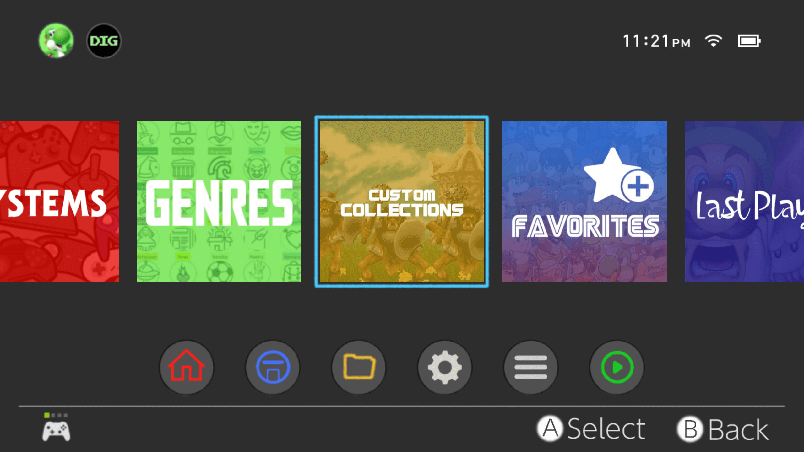
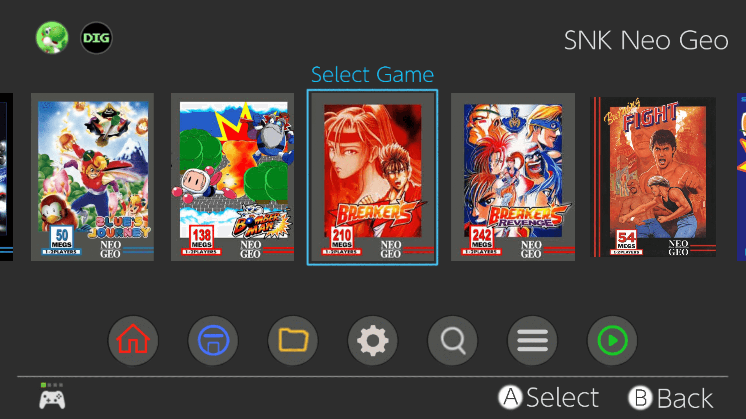
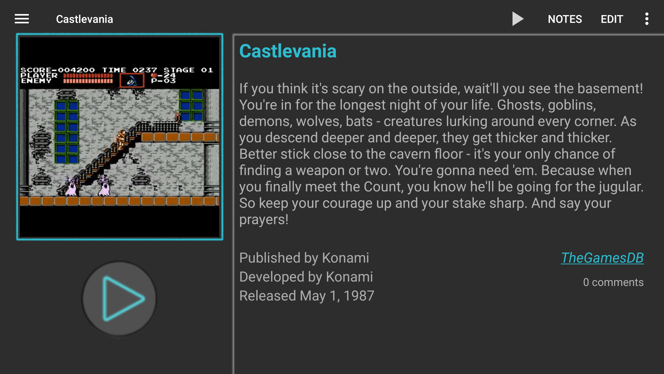
New Nintendo Switch Theme from creator of Mini-Mix theme.
I've been sitting on this theme for quite some time now as Huntzman had announced his intention to share a near identical theme and I didn't want to steal his thunder. People have shown an interest in me sharing what I've created so hopefully you guys like it. Around 140 systems supported.
https://drive.google.com/file/d/1QpcK1x_tvLcO9mV35yr82JniWoQ4TxRw/view?usp=drivesdk


Comments
New Nintendo Switch Theme from creator of Mini-Mix theme.
https://digdroid.com/forums/discussion/9234/new-nintendo-switch-theme-from-creator-of-mini-mix-themeVideo Tour
Aw man, it's too bad the clock and battery indicator aren't real, I've been messing around with a Switch light color theme and wanted to get those working but figured there's no way to do it.
Yeah, I was conflicted for a while about whether to include them and the pad at the bottom left considering their lack of functionality but the theme just didn't feel like the switch UI without them.
Due to request I've added backgrounds and icons for Famicom and Super Famicom systems. As usual with regional variants they will require renaming manually once the theme is installed.
Switched v1.1
https://drive.google.com/file/d/1SGpXhpcUNXMEAwsew6iQ5uQDBKiDlCiW/view?usp=drivesdk
Thanks Buster, I appreciate the love. I'm really looking forward to seeing your NXE theme be released as it looks amazing based on the previews.
how to switch themes to this themes i already download it but still cannot use it
how to switch themes i already download it but how to use it
Once you have downloaded the Switched.zip file, go into the main settings of DIG, go to themes and select install. Point the file browser to where the file was downloaded to on your device and select it.
I admire all the hard work you've put into this. I'm just wondering couldn't Dig be updated to have real features like boarders around tiles and functioning battery percentage and clock? I would love to see these features put into the options. It seems unnecessary to me to have to do so many creative work arounds to get this look if it could be in the settings.
It's been quite some time since I was able to get a response from the developer. There's always a chance that could change at any time but the last update for DIG was in May of this year and I've not got high expectations of seeing another update any time soon. In the meantime we do the best with what we've got I'm afraid.
Looks awesome well done
I need to move the youtube video more to the left because it gets in the way of the description of the game, does anyone know how to do it?
Same. My screenshots don’t fit the box properly. Any fix?
This is likely caused by one of two reasons. It is either the preview pane settings haven't carried over in which case you you could play around with those settings to get it to fit but I suspect it is more likely due to the different aspect ratio of your device. I only have experience with 16.9 devices so I'm not able to troubleshoot properly but I would start with the aspect ratio options in the main settings. First try setting the aspect ratio to theme if not already, next try 16.9 and lastly try the aspect ratio hack toggle to see if that helps.
Excuse me, can you send another link? The link above is invalid. Thank you.
For those planning a memorable event, Dubai’s party bus services are an excellent choice. Whether it’s a sophisticated night out, a fun birthday celebration, or a thrilling pre-wedding party Learn more, the convenience, luxury, and lively atmosphere of a party bus will ensure an unforgettable experience. With stunning views of the Dubai skyline, personalized services, and a high-energy environment, party buses in Dubai are an exciting and unconventional way to celebrate in style.