Issue: Android TV Grid View Scaling
Hi !
Apologies if this has been covered before. I looked an couldn't find anything.
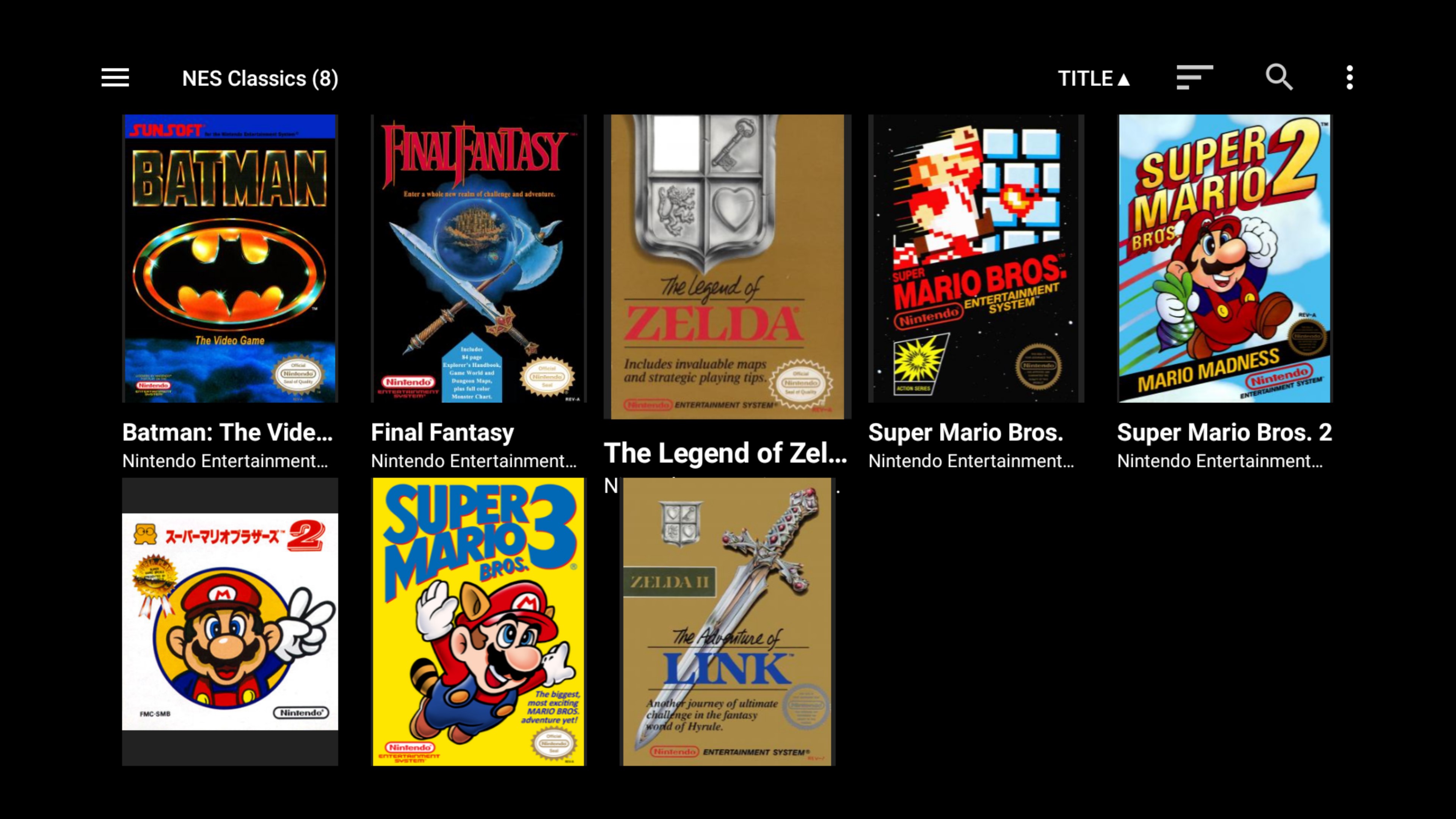
When in Grid View on Android TV, highlighted games on the top row have the box art obsucred by the toolbar at the top.
And on every row, the titles of highlighted games are obscured by the row below.
See attached exampled of Zelda NES with top and bottom obscured. I tried playing with the Resize option with no luck.
Hopefully on your list for future updates :) Thanks for the awesome frontend!
Cheers


Comments
Pressing the up button repeatedly in the resize control doesn't do anything?
Hi
Sorry this is very late! I missed your reply and forgot to check back.
Pressing up at the time didn't do anything, but it seems to be fixed now. Might have been an update since. Resizing allows me to space out the rows so there is no overlap.
However, the top of the box covers in the first row is still covered by the titlebar/toolbar at the top (see the Zelda example in the screenshot above), even when spacing out the rows. It seems the first row is not shifted down when resizing.
Thanks for your help. It's minor, but Hhpe you can look at this.
Cheers